Assignment Four
Select a current artist and designer and relate the process and design format for each. Compare and contrast the process and style to each other please use distinct historical references. Since this class is based on visual references particular attention is paid to composition and format. Students are asked to review and select these artists and designers from a modern style – 1930s to 1980s and from a post modernist style – 1980s to present. A supplemental reading is prescribed, typically one that deals with the concepts of “high” and “low” art. The student is asked to identify each selected work as “high” or “low” art and to contrast and compare the work as it pertains to its communicative ability within its historical context and its reach and interaction towards a combination of art or design. Students are then asked to critique the work from the prescribed design vocabulary and to write to that fact within their papers. A formal presentation is done to expose the class to a wider range of artists and designers.
Paper 4 Outline
Artists and Designers
This assignment is focused on showing the similarities and differences between a specific artist and a designer. In some cases the two worked at the same time and in other cases they were offset by decades.
The images will be discussed as they pertain to the Elements, Principles and Components of Design and how successfully they used these to communicate the concept and substance of the work.
- David Carson – Dada Typography
- Comic Book – Roy Lichtenstein
- Stefan Sagmeister – Andy Goldsworthy
- Paula Scher – Paula Scher
- Milton Glaser – early Picasso
- Alexey Brodovitch – Robert Motherwell
- Dan Wieden – Andy Warhol
- April Greiman – Heartsfeld
- Aaron Draplin – Coats of Arms
- Chuck Anderson – Larry Poons (early work)
- Chip Kidd – Fernand Leger
- Supreme branding – Barbara Kruger
- Erik Marinovich – Toulouse Lautrec
- Violaine & Jeremy – Albrecht Durer
- Louise Fili – Gustav Klimt
Elements
Line –
Shape –
Space – Illusion, Implied, Actual and Pictorial
Texture/Tone –
Color –
Principles
Balance – Symmetrical/Asymmetrical
Rhythm –
Unity/Variety –
Proportion/Scale –
Emphasis –
Components
Dominant –
Subdominant –
Focal Point –
Motion –
Counter Motion –
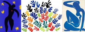
Henri Émile Benoît Matisse was a French artist, known for both his use of colour and his fluid and original draughtsmanship. He was a draughtsman, printmaker, and sculptor, but is known primarily as a painter.[1] Matisse is commonly regarded, along with Pablo Picasso, as one of the artists who best helped to define the revolutionary developments in the visual arts throughout the opening decades of the twentieth century, responsible for significant developments in painting and sculpture.
Analyze Matisse’s work via Elements, Principles and Components of Design.
| Element | Usage |
| Line | minimal line is used – primarily full shapes |
| Shape | shape is the primary element used to define the image/message |
| Space – Illusion, Implied, Actual and Pictorial – | Pictorial space is used primarily as that the image fills the plane and only minimally goes off of the plane |
| Texture/Tone | the tone is flat with no sense of volume or gradation |
| Color | mostly monochromatic or analogous only using contrast to access the focal points |
| Principles | Usage |
| Balance – Symmetrical/Asymmetrical | Mainly asymmetrical balance |
| Rhythm | Confined tight – used mainly with green squares |
| Unity/Variety | Very unified – variety used for emphasis – gathering into one shape |
| Proportion or Scale | Mainly in proportion but scale used to emphasize dominance |
| Emphasis | Color and shape changed used to create focal point |
| Components | Usage |
| Dominant – | Used via body shapes and common color |
| Subdominant – | Smaller star-like shapes and different body parts |
| Focal Point – | Red shape in center of body |
| Motion – | Mainly circular moving towards viewer |
| Counter Motion – | Large red bar behind flower-like object |
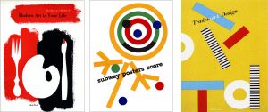
Paul Rand (born Peretz Rosenbaum; August 15, 1914 – November 26, 1996) was an American art director and graphic designer, best known for his corporate logo designs, including the logos for IBM, UPS, Enron, Morningstar, Inc., Westinghouse, ABC, and NeXT. He was one of the first American commercial artists to embrace and practice the Swiss Style of graphic design.
Rand was a professor emeritus of graphic design at Yale University in New Haven, Connecticut where he taught from 1956 to 1969, and from 1974 to 1985. He was inducted into the New York Art Directors Club Hall of Fame in 1972.
Analyze Rand’s work via Elements, Principles and Components of Design.
| Element | Usage |
| Line | minimal line is used – primarily full shapes |
| Shape | shape is the primary element used to define the image/message |
| Space – Illusion, Implied, Actual and Pictorial – | Pictorial space is used primarily as that the image fills the plane but in some go off of the plane for emphasis |
| Texture/Tone | the tone is flat with no sense of volume or gradation |
| Color | mostly monochromatic or analogous only using contrast to access the focal points – also using tone to establish unity in background elements |
| Principles | Usage |
| Balance – Symmetrical/Asymmetrical | Mainly asymmetrical balance |
| Rhythm | Starts to move randomly – used mainly with purple squares |
| Unity/Variety | Very unified – variety used for emphasis – supporting main complimentary shape |
| Proportion or Scale | Mainly in proportion but scale is used to emphasize dominance and to create rhythm |
| Emphasis | Color and shape changed used to create focal point |
| Components | Usage |
| Dominant – | Used via body shapes and common color |
| Subdominant – | Smaller star-like shapes and different body parts |
| Focal Point – | Red shape in center of body |
| Motion – | Mainly circular moving towards viewer |
| Counter Motion – | Large red bar behind flower-like object |
Conclusion
Write 200 words on the similarities and differences of both the artist and the designer.
Who “wore it best”?
Which was a better use of the style and format?
Did the use of style and format successfully communicate the message(s)?
Could the artist or designer have used a different style or format to communicate the message?
Bibliography
Due Date: 12/7/18
http://www.artinamericamagazine.com/reviews/overview-between-the-high-and-the-low/
Great Article found by Erik Solares
– https://www.therapidian.org/high-and-low-art
Also Ziggy Stardust for Ponds?
watch –


